Digital Products
When your entire product depends on proper communication — you need a good content designer.
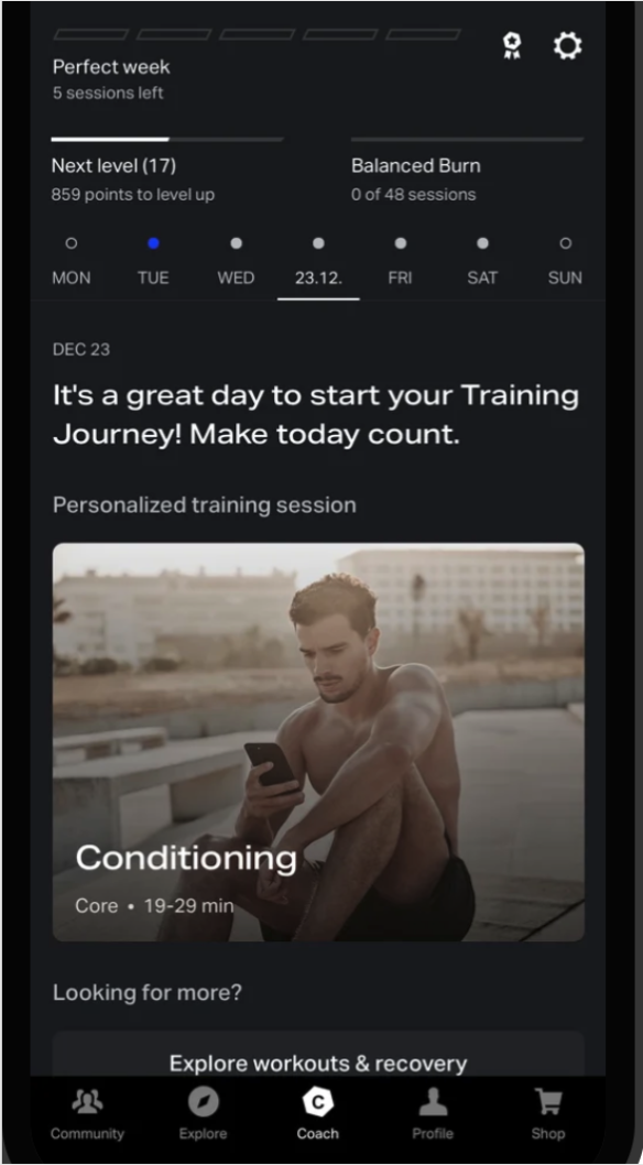
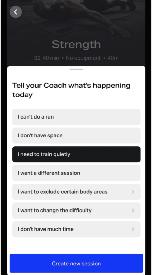
What is Freeletics?
Freeletics is a training app for the masses. Wherever you are, whatever equipment you have or don’t have, even if you’ve only got a few minutes, Freeletics has a workout that will kick your ass.
How it works — in a nutshell
I tell the app’s digital “coach,” who consists of a reactive algorithm or an AI coach built by a team of sports scientists, a few things about myself, such as my:
fitness goal (run faster, gain muscle, etc.)
how often I currently do fitness per week
equipment available (kettlebell, jump rope, etc)
more
The coach takes in this information and recommends an 8-12 week training plan.
As I work through the plan, my coach takes note of my performance and my feedback after each workout and adjusts the following workouts accordingly, ensuring my program isn’t too easy or hard for my fitness level.
Our target group
We’ve got it all. Teenagers to senior citizens, the super-fit to the I have no idea what I’m doing but I’m here for it. We’ve helped countless people implement healthy habits or surprise themselves by pushing their own limits.
Freeletics Case Study: Product Efficacy
Problem identification
I carried out a status quo analysis of a flow that guides users from the opening tab to starting their workout.
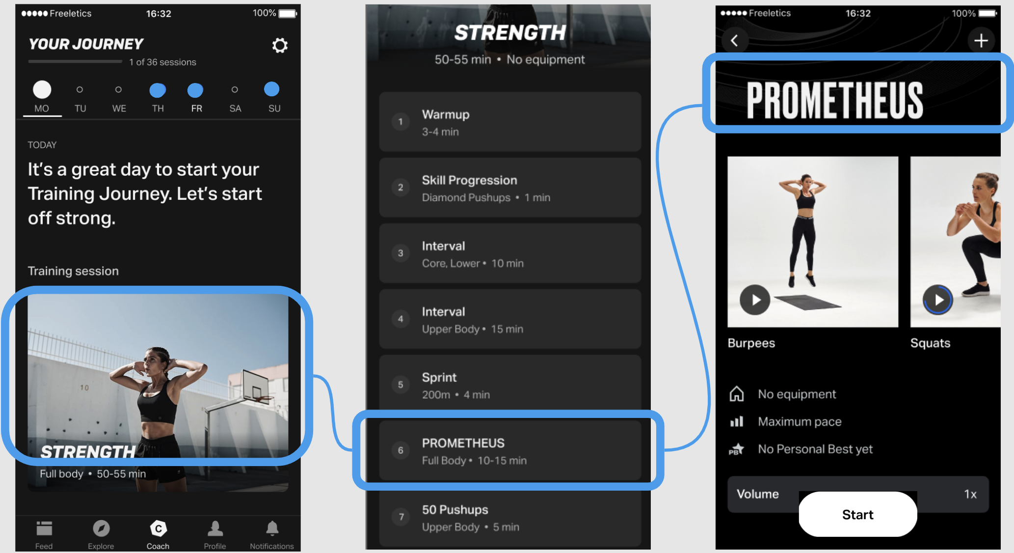
First, I set up a prototype and provided 10 users with pre-written questions regarding their understanding of how to properly perform each workout section. I wanted to know how effective our coach communication was in this direction or, in other words, to what extent our users knew how to properly perform the workout when pressing “start”.
Test results indicated that a majority of participants misunderstood the ways in which our coach intended for them to perform several workout sections. For examples, users were concerned about
pace - “I wonder what intermediate pace is considered”
the intention of a “skill progression”
the goal of a “God” workout.
Obstacles to consider
In clearing up these misunderstandings, the design would largely need to remain the same. At most I could add a few lines.
Nomenclature of the sections, for marketing reasons, would also remain for the time being. Revisiting “God” workouts or the term “Skill Progression” wasn’t on the table at this point.
Goal
Communicate to users how to correctly perform each workout section as our coaches intended with a few lines.
What happened & why it matters
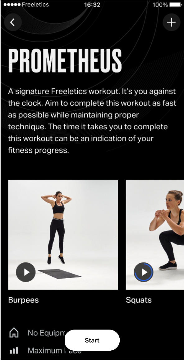
I drafted workout component descriptions, included them into the prototype,
and sent it out for a new round of testing.
The second prototype led to two key findings
1) Users do indeed read this copy rather than skip it over
2) This step cleared up nearly all confusion on how to properly perform each workout section
Next steps
1) I clarified the intention and proper performance method of each workout section with the coaches.
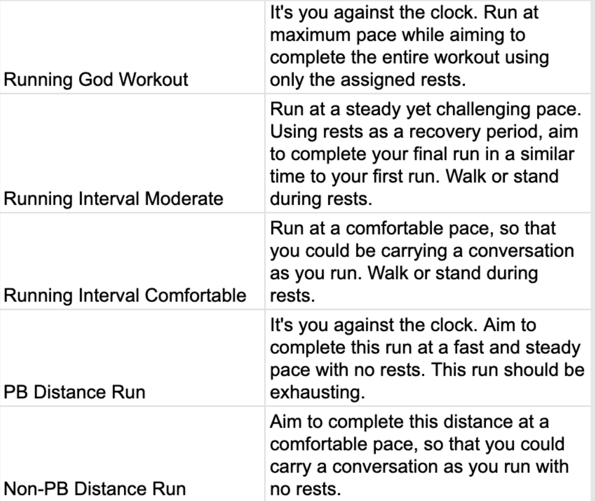
2) I stripped down long paragraphs of fitness jargon to more informational, measurable, and conversational wording.
3) I did this for warmups, cooldowns, the various forms of intervals, and all other workout components.
An example of how we describe running paces for different purposes:
Why am I showcasing this project?
This project required me to conduct research, analyze results, build and test content design solutions around constraints, and collaboratively implement those solutions, all with the intention of making our product easier to understand and thus more effective.
Freeletics Case Study: Inclusivity
Problem identification
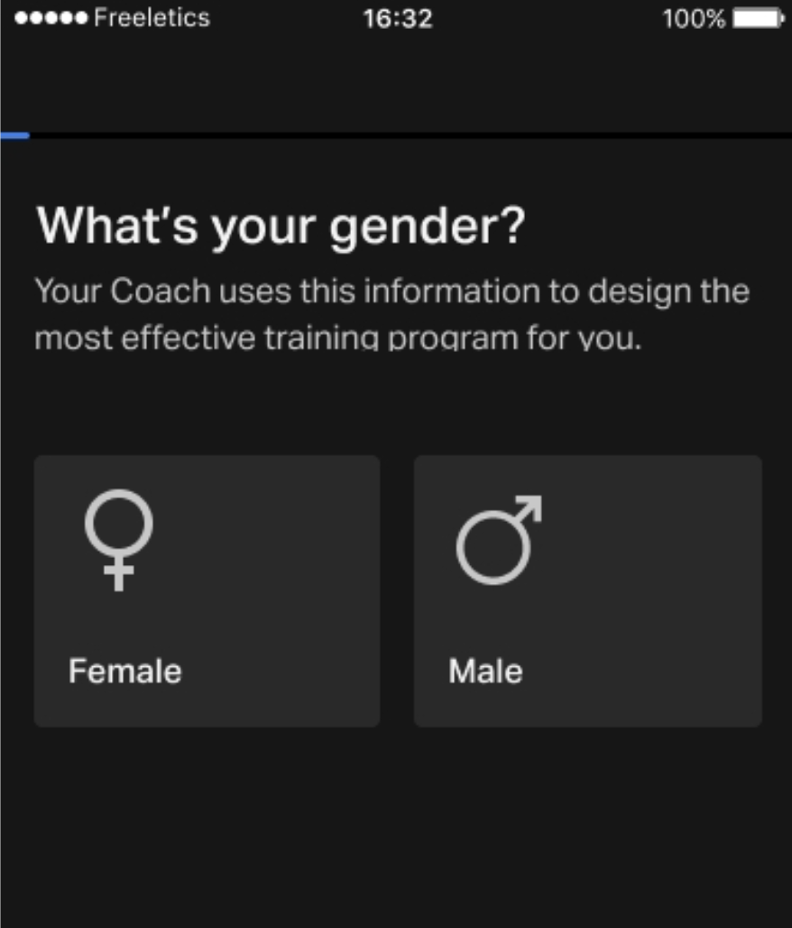
Our very first onboarding question required users to identify
themselves as male or female. This excluded our non-binary users.
Obstacles to consider
This one was tricky. Our entire product is based off of two separate algorithms. Men and women receive different training programs. This is a whoooole other issue, but here, adding a third or more answers wouldn’t have worked with our two existing algorithms. We would’ve had to rewrite the entire product, or decide on one algorithm.
Furthermore, this is the first interactive screen a user sees during onboarding. Any increase in drop-off rate here would have been deadly for conversion rate.
Goal
Make our product more inclusive of non-binary users without rewriting the app.
What happened & why it matters
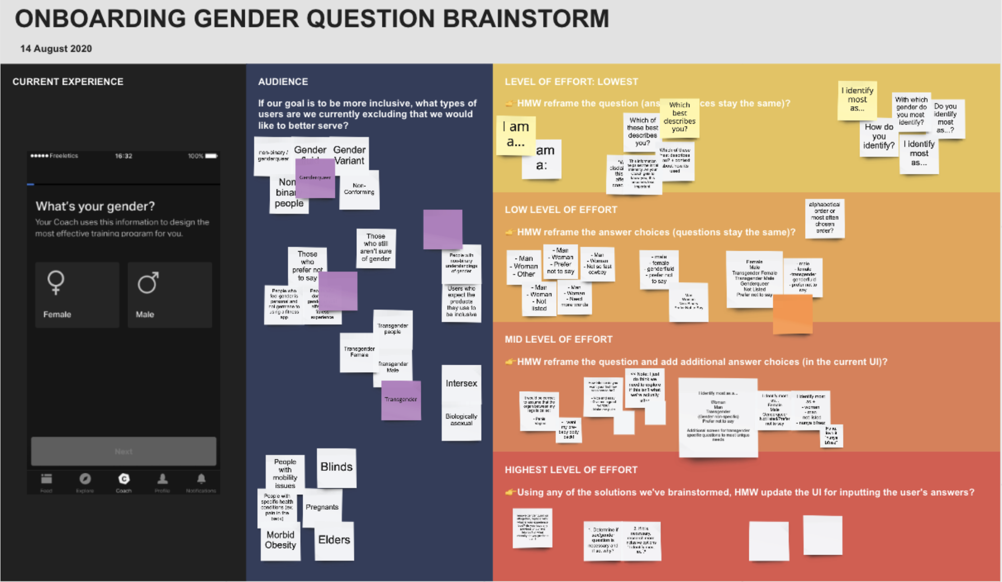
We have a diversity & inclusion group at Freeletics. We got together to brainstorm solutions. I also conducted online research non-binary preferences of self-identification and brought these insights into the workshop.
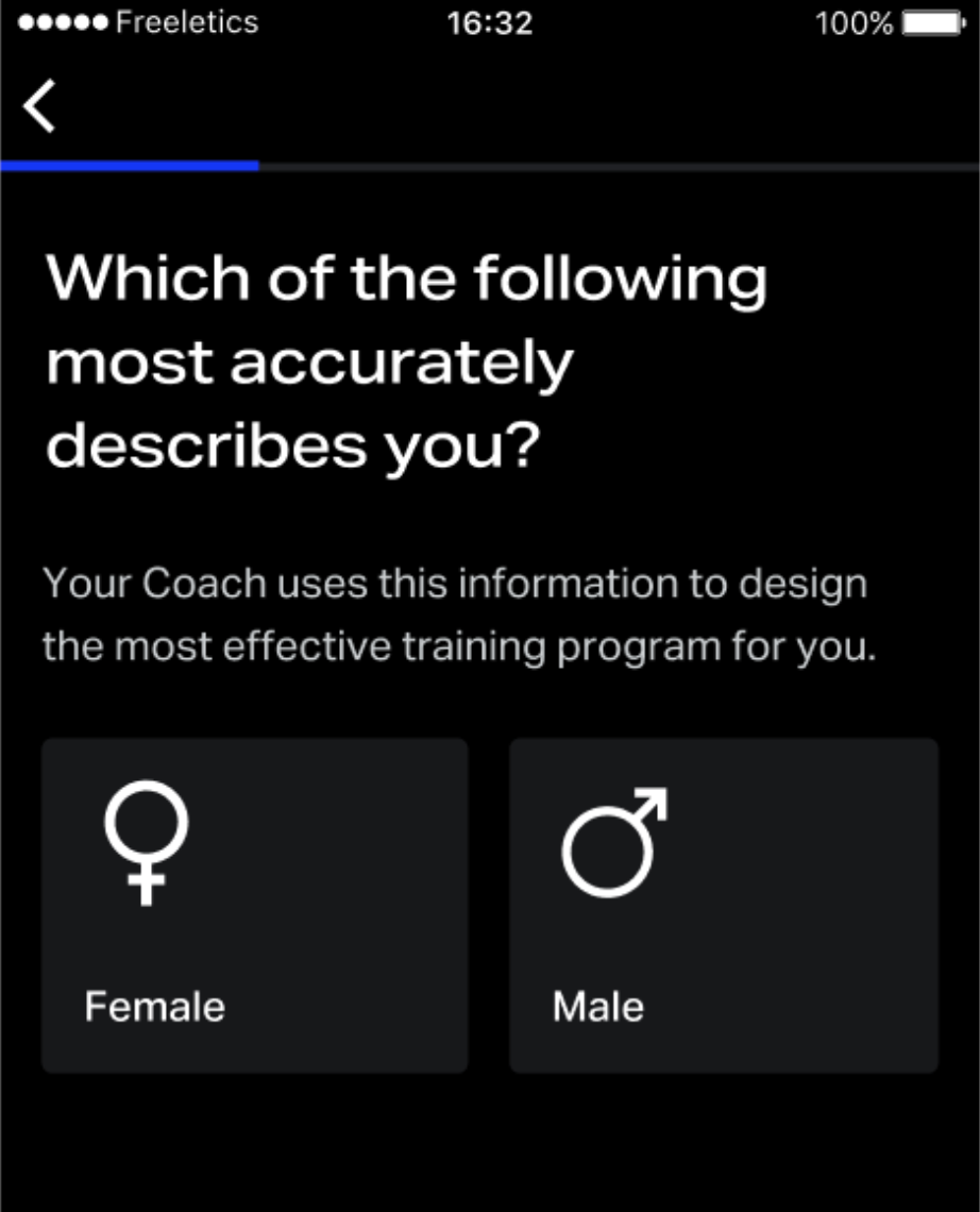
And the result of the brainstorm was to adapt the wording of the onboarding question:
Sent to testing, drop-off rates were unaffected, and the new wording was shipped.
Why am I showcasing this project?
I do believe that words influence the ways in which we think and perceive our surroundings. This small change did not solve transphobia, nor did it rectify the binary nature of our product. But it did adopt a slightly less binary approach to gender and as a result hopefully reduce the sense of exclusion felt by any of our non-binary users.